Dollar 
Car Rental System

About the project
My Role:
- User research
- Design Thinking
- UI/UX design
- UI Kit
- Prototyping
- Interactive Design
- Communication and collaboration
Dollar, a leading car rental company in Iceland, approached us to improve their digital booking experience.
Their existing booking system was built on an external API, which caused inconsistencies in the user experience, limited SEO performance, and made it difficult to manage content or adapt the booking flow to user needs.

Main Pain Points
Challenges
Dollar's website faced several challenges that directly impacted the quality of the user experience, the visibility of content, and the flexibility of the product.

Key Improvements
Redesigned Booking Flow
One of my key tasks was to completely rethink the user journey from browsing to booking. I redesigned the interface to make the booking process:
- Faster and more intuitive, with clear navigation and immediate access to key actions
- Consistent across the site, visually and functionally
- Streamlined, reducing steps and decision fatigue


Key Improvements
Pricing
Transparency in UI
To improve trust and usability, I restructured how pricing information is displayed across the site:
- Clear visual hierarchy for total price and daily rate
- Interactive tooltips and breakdowns to explain fees
- Consistency across desktop and mobile
This helped eliminate confusion and increased conversion rates by reducing cognitive load at checkout.

Key Improvements
Conversion-Focused Upsells and Promotions
I designed and defined the logic for upsells, ensuring they were seamlessly integrated into the user flow
- Dynamic banners tied to specific car categories
- One-click upgrades to premium vehicles
- Embedded prompts for insurance and add-ons
These additions increased average order value while maintaining a clean and minimal interface.


Key Improvements
Booking Continuity & Self-Service
To reduce drop-offs and improve trust, I designed a seamless flow where interrupted bookings are saved and users can manage their reservations through a dedicated account area. The experience is fully mobile-optimized, enhancing autonomy and minimizing friction.


Key Improvements
SEO-Driven Content Architecture
As part of the product strategy, I collaborated with SEO and content teams to transform filterable car categories into fully indexable landing pages, design a modular blog system, and structure components semantically. This significantly boosted organic traffic and improved visibility for key rental categories.

Key Improvements
On-Page Booking Access
I integrated the booking form directly into the vehicle detail screen, combining inspiration and action on the same page. This change minimized friction and helped users move confidently from browsing to booking.

Summary
Mobile-First Design & Testing
With many users booking on mobile, I created mobile-first layouts with touch-friendly elements and optimized spacing. I tested the interface across devices and platforms to ensure usability and clarity throughout the booking funnel, focusing on minimal input and smooth, thumb-friendly navigation.

Results
What have we
achieved 🎉
The integration of the booking system within the main website significantly improved the user experience, SEO performance, and business outcomes.

Recent Projects
-
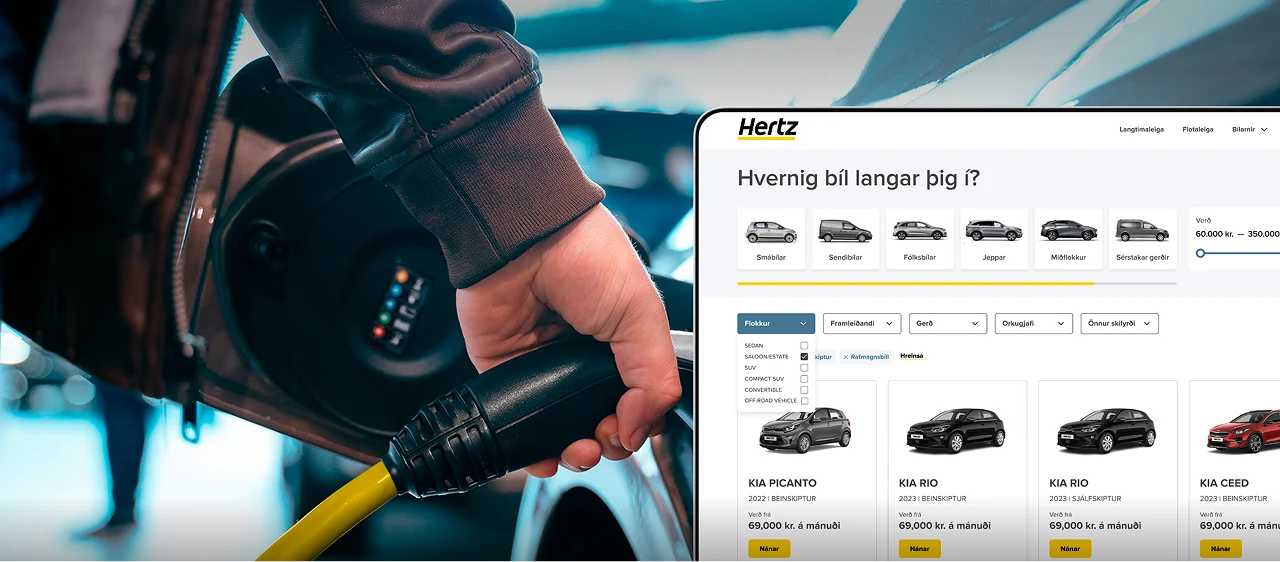
Hertz
A complete redesign of Iceland’s top rental platform — streamlined search, smart filters, and custom booking flows for every car type.
-
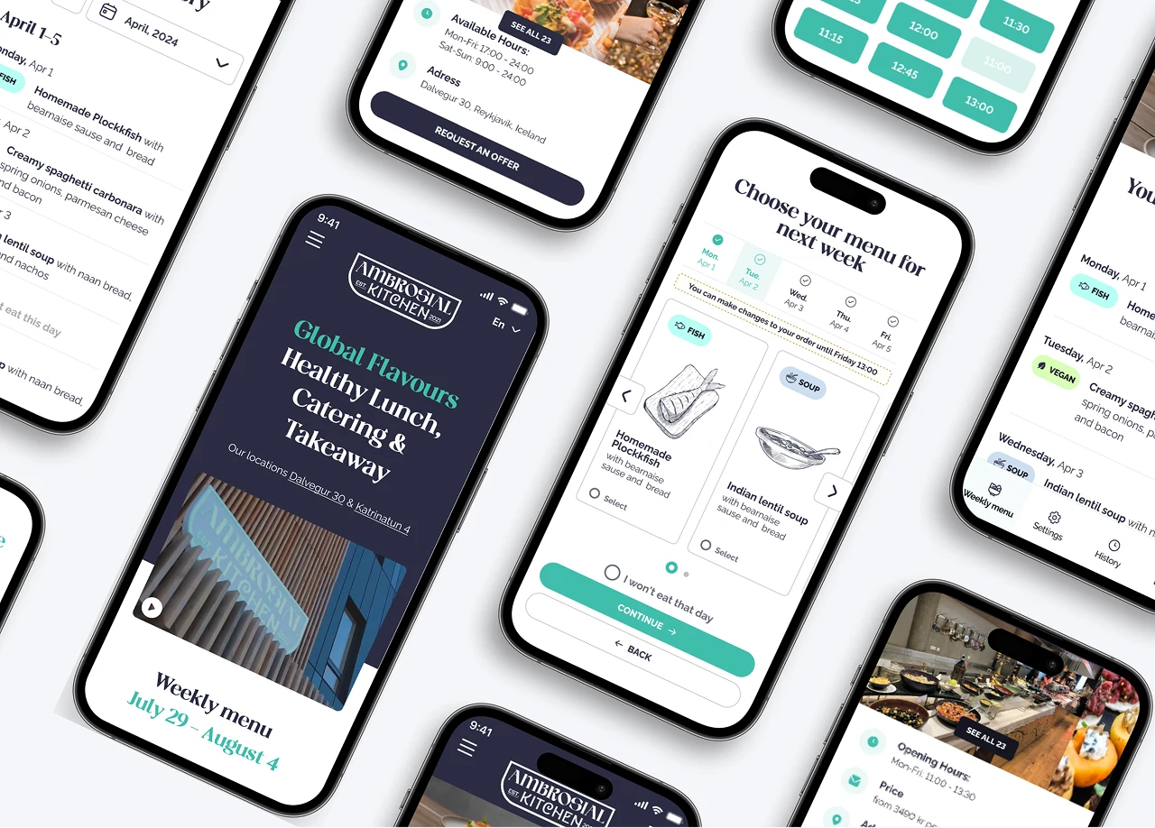
Ambrosian Kitchen
Designing a Scalable Meal Management Experience

