Brimborg 
A complete redesign of Iceland’s top rental platform

About the project
My Role:
- User research
- User Flows & Wireframes
- UI Design & Design System
- Prototyping
- Communication and collaboration
Brimborg is a leading vehicle rental company in Iceland specializes in providing a range of vehicle rental options to suit various needs.
They offer long-term rental services for both local residents and corporate clients, focusing on a user-friendly online booking experience, transparent pricing, and flexible rental terms.
I supported the project across all stages — from early redesign concepts to full implementation of the platform and design system.

Confusing UX and inconsistent visuals
Before the Redesign
The old site lacked structure, clarity, and a cohesive design system. Users had difficulty navigating, filtering car options, and understanding rental features. The experience felt outdated and didn’t support seasonal needs like winter rentals or 4x4 filtering.

What our users really needed from the platform
User Research Insights
Through interviews and research, we uncovered key user needs: simplified filtering by car type, fuel, and rental purpose (family or corporate); an easy, all-in-one booking flow; and customization options for new cars. Users also expected real-time updates to search results and filters for winter-ready vehicles — features the old platform didn’t support.

Where the experience was falling short
User Pain Points
Users struggled with a lack of intuitive filters, an overly complex booking flow, and limited customization options. The absence of winter-specific rental filters and real-time search updates added friction to the experience. These gaps made it harder for users to find the right car quickly and confidently.

Understanding who we’re designing for
Target Personas
Based on our research, we identified our core audience as locals aged 25–50, including individuals and business clients looking for flexible long-term rental options. They value convenience, reliability, and the ability to adapt rentals to seasonal needs — such as winter-ready vehicles or family-friendly models. Customization, clarity, and speed are essential to their decision-making process.

Laying the foundation for a streamlined experience
Early Structure & Wireframes
Based on user insights, I created a scaled-down version of the site to visualize the core flow. It included key screens like the Home page, Search with filters, and the Car Detail page, as well as the main steps of the booking process. This helped align the team on structure before moving into high-fidelity design.

Creating a seamless and consistent search experience
Search Page Improvements
My main goal was to design an intuitive and consistent user journey — from the first interaction to final booking. The previous search experience was cluttered and hard to navigate. We focused on simplifying filters, improving layout clarity, and enhancing usability

A guided flow from discovery to confirmation
Search & Book
Happy Path
I simplified the booking experience into three clear steps: car configuration, rental period selection, and final confirmation. Users can filter by type, brand, fuel, and more, then explore car details and customize their vehicle before booking. Toggle tabs for new, used, and winter cars help users find what they need faster.

Learning from industry standards to improve usability
Competitive Analysis
I analyzed how leading rental platforms structure their search experiences. A key takeaway was the use of smart search — showing relevant results as users type. Combined with intuitive filtering, this greatly improves speed and clarity. We applied these insights to implement a similar smart search feature on the Brimborg site.

Testing layout variations to improve usability
Search Page Explorations
I explored multiple layout options to improve the search experience. In the first version, filters were fixed on the left side, which users liked for quick access. In the second version, filters were placed at the top, with four car cards per row — reducing scrolling and improving visual clarity. Users preferred the second layout for its clean structure and ease of use.

Finding the clearest way to guide users through booking
Booking Flow Exploration
I tested two layout variations for the multi-step booking process. In the first version, steps were fixed at the top with real-time updates shown inline — including selected options and pricing. In the second version, step values appeared in a summary block on the right. Users preferred the first version for its clarity, visual feedback, and overall ease of use.

Simpler, faster, and more flexible booking
Final Design & Key Improvements
We improved the filtering system, added real-time search updates, and introduced full car customization with automatic pricing. The result — a streamlined experience that helps users find and book the right car with ease.


Ensuring consistency and smooth collaboration
Design System & Handoff
I followed a structured design system, adding all components to the style guide with clear behavior descriptions for developers. Using auto-layout, variants, and responsive design, I created scalable UI components. After approval, I linked interactive prototypes for testing with the team and stakeholders, and designed a mobile version for full cross-device support.

Real improvements backed by data
Success Metrics
These outcomes reflect a more efficient, user-centered platform that performs better for both users and the business.

Recent Projects
-
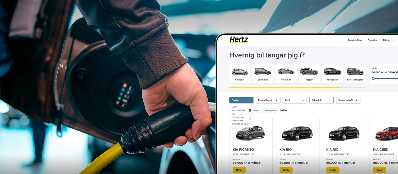
Hertz
A complete redesign of Iceland’s top rental platform — streamlined search, smart filters, and custom booking flows for every car type.
-
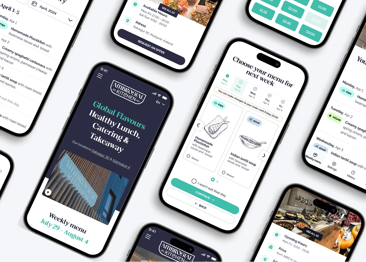
Ambrosian Kitchen
Designing a Scalable Meal Management Experience

